Field Notes From an Event Apart 2009 for Web Professionals - Day One
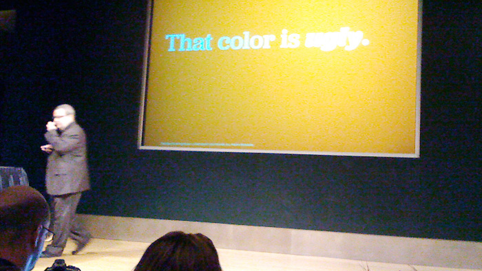
Jeffrey Zeldman on Redesign, session 1
Be a strategic design partner, or else you will not influence the design …do the research. --@Zeldman
Showing your strategy and flexing your authority…
- For navigation, use cards and ask the the client, or test group to put the cards in order.
- Use creative ways to focus on the user by creating visuals of your personas, cardboard figures that you can address questions too. What would "Mac" want to see on the home page?
- Make your design solution work for the user's needs.
- Use a 'Content Strategy' document and include an executive summary, to remind the client what is important with regard to the site contents.
- Jeff uses an method to keep the conversations open, "Alzeimers Method" - dropping breadcrumbs or gentle reminders of previous conversations or the client's needs.
- Be sure to convey the meaning of design, talk about why the decisions were made, indicating what the client communicated was important.
- Handle criticism, go back to the user for the resolution. How will the user react?
- Jeff is happy to use pixels again instead of measuring layouts in ems; thanks to browser zoom.
Design is like music, when you (or the clients) see it you say, "yeah that's us" or "no that's not us." --@Zeldman
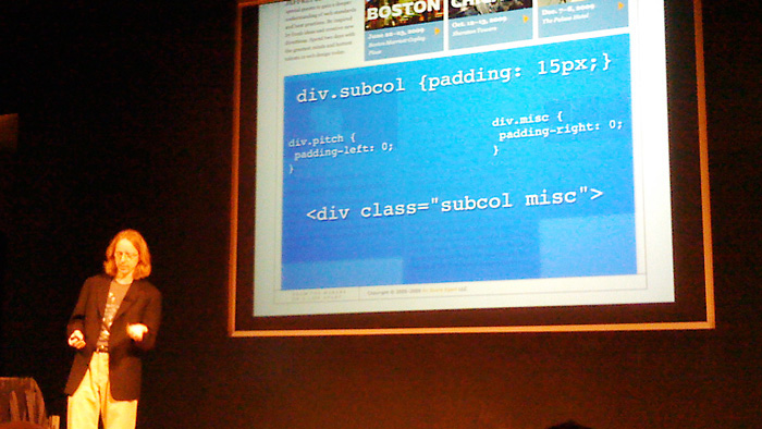
Eric Meyer on Redesign of AnEventApart.com, session 2
My fingers start to itch to code it, is id done? --@Meyerweb
Comments from the CSS guru
- I still care about Internet Explorer 6, if my visitors use it.
- Minimize IE hacks no need to use separate stylesheet, * html, *+html, etc.
- It's ok to like margins again, when it comes to layout.
- Sometimes you may want to run CSS thru server side code, e.g. PHP
- Image replacement for lead-in graphics using h1 element
- Push the limits with mark-up and style but roll back to what works and is accessible (HTML 5 / CSS 3)
- Some emerging concepts, microformats - hcalendar, may not be accessible so don't worry about using it now
- Eric Doesn't agree with Jeff on pixels, still uses ems for fonts (no universal page zoom for ems yet)
Balancing complexity- "I can make the markup more complex, or I can make the CSS more complex, minimize complexity for maximum gain (bandwidth wins)." --@Meyerweb
"Presentation never trumps semantics… well hardly ever." --@Meyerweb
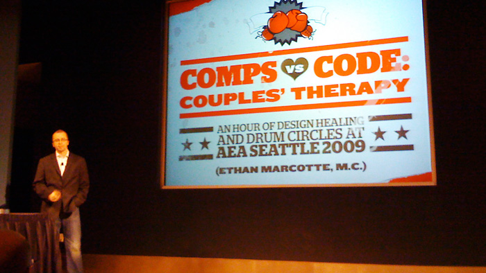
Ethan Marcotte - Comps vs. Code, session 3
Lots of little leaps of faith. --Ethan (Airbag)
Ethan spoke about the redesign of W3C and fluid width (grid based) layout. He
used the same formula we use for em font sizing. Target divided by Context
(parent) equals Percentage/width (use the long decimal value, let the browser
truncate)
Advice from Ethan:
- Designers should share important features with developers early on.
- Learn from your mistakes
- Use: Son of suckerfish dropdown (CSS) menu
- When changing hands, communicate the details, this is where they are usually lost.
- Transitions in the process: Discovery > Design > Development > Delivery
- Focus on good typography not sexy graphics and hey-hey.
- Their is a difference between client-ready and coder-ready (comps or wireframes)
- Process should include designer review and developer reviews
- Communicate the details in whatever method works for you, but do it.
Fluid layout examples:
- vitabit
- clearleft
- simplebits
- search "fluild layout" on AListApart.com
- NYmag
Luke Wrobleski - Web Form Design, session 4
Forms suck. --@LukeWDesign
Luke spoke about best practices for form design and a clear path to completion
based on vast user research data working at Yahoo
Question we should answer for our users:
- What do I need to fill in here?
- Why do you need my … email/username, etc.?
- How can you help me
The form shouldn't be your master, you will control your own destiny. --@LukeWDesign
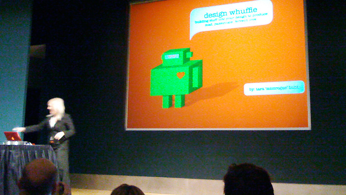
Tara Hunt - Social Capital Equals Whuffie, session 5
You can either fake marketing with whufflie or realize that the new marketing is whuffie. --@Missrouge
Five principals for raising whuffie http://slideshare.net/missrouge
- Create amazing customer experiences
- Throwing sheep
- Lighten up
- Embrace the chaos
- Find your higher purpose
Connections plus time equals trust. --@Missrouge
Measuring your whuffie : Zipcar, Rating6, ScoutLabs
Kristina Halverson - Content First, session 6
Content is not a feature. --@Halverson BrainTraffic.com
Content Strategy plans for the creation, publication and governance of the
content; everything on the web, text, data, info, audio, video, etc. She swore
everyone in with the statement, "I will never again say launch, I will say
lifecycle". She advocated that we fight for quality content that is useful,
usable and enjoyable. She encouraged that web writers ask journalistic
questions; content demands resources and processes to match up business
objectives with user's needs.
Kristina's examples:
- Good: Mint.com
- Bad: Quicken.com
Jared Spool - User Interface Engineering, session 7
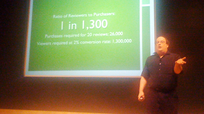
Ratio of reviewers to purchases is 1:1,300 - thanks the lunatic fringe. --@JMSpool uie.com/brainsparks
Revealing design treasures from the Amazon
- Great content strategy!
- Vote for reviews, "Was this helpful?"
- Button, "most helpful first"
- Don't be afraid of new ideas (goldbox hey buy this stuff! or diamond selecting tool)
- Redesign is a bad idea, simple changes overtime (iteration)
- Facebook redesign, 97% of users didn't like it
- Never forget about the business
- Amazon can make money selling iPods at cost, looks like a loss but with 'negative operating cycle' they use 'cash float'. Most resellers order very 45 days, Amazon depletes inventory in 20 days.
- Fun: 'Playmobile security checkpoint' & 'Tuscan Whole Milk'
Goal Time vs. Tool Time
Goal Time:
- When the user is improving the outcome of the experience
Tool Time:
- When the user is moving forward with improving the outcome of the experience